Wednesday, February 27, 2013

FRIDAY PHOTO [FACE]

Honestly the worst editing- it's difficult to follow the 
tutorial: http://www.youtube.com/watch?v=FOSTFz-4dmk
because I haven't updated my photoshop so I don't have all
the materials needed for this.. 

Motion Blur

Tuesday, February 26, 2013

Erik Johansson Photography

Erik Johansson - Berlin, Germany

Erik Johansson is a successful photographer and retoucher that creates illusions in his photography. "To me photography is just a way to collect material to realize the ideas in my mind." Johansson uses his ideas to begin a project, draws it out or visualizes it, captures photos usually from very different locations and then creates it on photoshop sometimes using over one hundred layers. Johansson has worked with many companies such as Google, Stratco, TAC and Microsoft. His photos have unexpected twists that look realistic and it will make you double check the photo. Johansson's photos are flawless and imaginative. 

Here are a few of Johansson'd work
Common Sense Cross

In this photo, Johansson has flipped one of the roads upside down
but still keeping the roads connected and lined up.  It takes awhile
to realize all the different objects that have been reversed, it is
interesting how the photoshopped part of the photo goes straight
through the centre of the image. I like this photo because for a second
I thought it was possible. 

Stay In Bed Day

Johansson created this photo for an advertisement for one of the many
companies he has worked with. I like this photo because this is how
some people may think in the morning since they never want to get out
of bed, I am one of those people for sure so I can relate. The bed is pulling
her back in, the temptation to sleep is so easy and it is tough to fight it off.
I want to be able to figure out how to do this because the blending of the
two photos is well done.

Cut And Fold

This photo is the coolest I find, just because Johansson was able to
literally bend the earth and fold it over. The photos used to manipulate
this image is perfect such as the field divided by a road with the scissors
label. I like this photo because the concept is genius and looks as if
it could actually be a reality.

Monday, February 25, 2013

Colouring with Black&White

ORIGINAL -- NOT MY PHOTO
http://s3.favim.com/orig/43/bangbangg-black-amp-white-black-and-white-eye-Favim.com-364427.jpg
Credits to google- found this photo searching up "black and white eye"
I was just looking for something that I could add some colour too, and I find eyes are beautiful so I
used Adobe Photoshop CS3 with brush to colour the image. The drawing itself is so realistic and doesn't
need to change or even have colour, but it was something to do so here it is.
Edited

Focus&TheLens[Objects]

Mastered Focusing Objects In Between Each Other
Bowling Ball Piece In Focus
Milk Carton In Focus
White Paper In Focus
Shoes In Focus 
All Slightly Out Of Focus


Worms Eye & Edits [FridayPhotos]

All of these photos have been taken in worms eye view and
 adjusted by levels, brightness, contrast, hue and saturation.
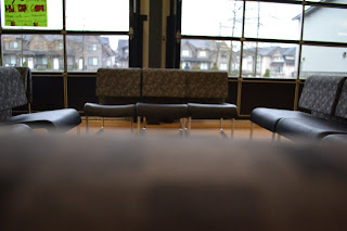
Theme: Chairs

Original 
Edited
To enhance the detail on the bench, I darkened the photo
and changed the saturation to make the green stay bright

Original
Edited
Wanted to focus only on the middle section so I made it
into pink hue, and left the outsides in black and white

Original
Edited
I tried to take away the shine on the chairs but ended up just
making it darker and only changing the colour of the squares
Original
Edited
The way this picture is taken makes me think of lily pads in
a pond so I made the hue green and tried to make it bright
 
Original
Edited
Making the picture lighter and adding contrast reveals the
detail in all of objects around the chair, as well as the wheels
on the chair.


Friday, February 22, 2013

DavidHockney2

So I was bored and decided to make another attempt at the David Hockney montage, 
same effects are applied, using the drop shadow on each photo to appear
as tiles. Also this photo doesn't stretch out longer than the other one and I think I only
used about 8-9 photos because I forgot to turn 180 degrees. 
Personally I like this montage better than the first one, feel free to check out the other 
one on the following link:
http://mirandaheinx.blogspot.ca/2013/02/david-hockney.html

Worms Eye View

My theme was chairs and this was as good as my editing skills gets.
I used Levels, Hue/Saturation and Brightness/Contrast. 
I don't really know what I was aiming for here, but I am satisfied with the end result.
It is nothing fancy and overall I think this was one of the more successful 
worms eye photo that I took today.

Normal
Edited

Wednesday, February 20, 2013

Tiger Face

I like the portrait photos of people who change half of their faces into an animal, which is usually a tiger. Theres been a few websites on it and youtube videos but the trials never work out for me... If anyone can send me a link that uses photoshop CS3 that would be great because I would love to test it out xx

Perspective View

I have three subjects in this range of photos:
Boy1, Boy2 & Pointer Finger
I was playing around with the fine focus on the Nikon D3100
and focused on the farthest object only, then on the one in the
middle, along with the object closest to the camera lens.
I wasn't really able to focus on all three at once though...
I'll try again soon.

Far
Middle

Near

Tuesday, February 12, 2013

David Hockney

This is my attempt at a David Hockney montage. I took pictures in between two large spaces because I thought it would be a good challenge to try and piece it all together. On photoshop CS3 I changed all of my picture sizes to 10" by 7.5" on a 24" by 36" canvas. I tried to tilt the photos in order to match all of the items along borders and flooring. Also to create a panoramic view with multiple images. There are fifteen photos in total with the effect of a drop shadow 180 degree angle with an 100% opacity in order for each photo to appear on top of each other and see each photo separately. No additional effects or colour changing.