Friday, September 13, 2013

Wednesday, May 29, 2013

Tuesday, May 28, 2013

FRIDAY PHOTO [OPPOSITES]

Night Riders Shadow

Assignment: Photographer Mimic


Mark Raymond Mason

Fine Art Photographer - Mark Raymond Mason

Background & Schooling
I don't have any education in photography.  I studied Geomatics Engineering at BCIT (British Columbia Institute of Technology) and U of C (University of Calgary) for a total of 6 years.  Right now, I'm studying to become a professional land surveyor.”

Awards
“I don't enter photography contests very often, but I won a couple of Merit awards in a B&W magazine contest in 2008.  The website has won several online awards of various dubious distinction as well, usually for presentation and photographic content.”

Equipment Used
“I like to use small digital cameras with interchangeable lenses because they're portable, lightweight, and capable of excellent results if used carefully.  However, these photographs could have been made with using many different types of equipment from many different manufacturers.”


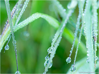
Dew-Crusted Grass: Coquihalla Summit, BC, Canada (2011)

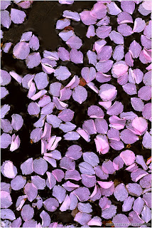
Petals, Water: Vancouver, BC, Canada (2005)

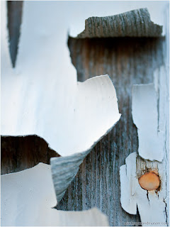
Tack, Detached Paint: Kamloops, BC, Canada (2012)

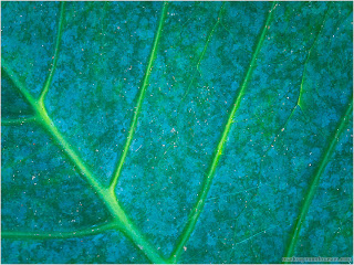
Sunlight, Veiny Leaf: Near Atenas, Costa Rica (2013)

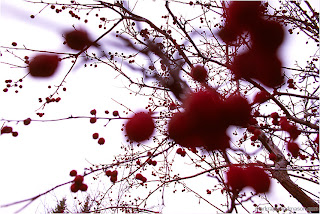
Berries, Branches: Calgary, AB, Canada (2006)


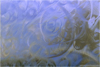
Brushed Steel: Vancouver, BC, Canada (2005)


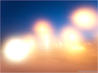
Light Circles, Night Sky: Calgary, AB, Canada (2010)


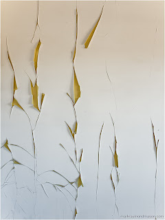
Pale Paint, Spreading Cracks: Near Kamloops, BC, Canada (2012)
Marks work is abstract and he visualizes scenes in a way that others might not think of taking it. I like his photography because he focuses his photos on the little things around big things. Mark doesn't edit his photos with photoshop, these photos are the originals. He captures the vibrant colours and the sharpness in objects which makes his photos stand out.

Strengths: An eye for unique options, versatile angles, lighting and contrast.
Weaknesses: Not many, just a little sharper on defined objects or too far away.

I interpret Mark's work as focusing on the little things that people miss on a daily basis since everyone is looking for the bigger picture. The photos are sentimental and meaningful which makes you take a double take when looking around you afterwards.


Wednesday, May 22, 2013

FRIDAY PHOTO [MAKES MY HEART SING]

I love the flowers colours, they go so well together, the red/orange/pink colour
is gorgeous. I see these flowers every morning and they put me in a better mood to
see something so precious.

Alphabet In Objects

Took pictures of objects around school and made a collage from a-z.
Not as difficult as I though it was going to be, finished in a day

Friday, May 10, 2013

FRIDAY PHOTO [WAITING]

This is a picture I took of my friend, I took five separate photos and joined them all into one.
This is to portray time passing by and he is tired of waiting for someone that keeps letting him
down, which is why he loses colour in every frame because he has a loss of hope for that one person.

Wednesday, April 24, 2013

FRIDAY PHOTO [CHANGE OF SEASONS]

Change of Season

I had to take this picture near my school because the trees are so vibrant right now. I love the red tint of leafs, the colour is really pretty and its nice to look at. I maaaaaay have brightened the photo to make it look brighter, but this is how it looks and the camera didn't capture all its beauty.

Monday, April 22, 2013

Hazard Assignment

Here are 4 original photos I took using Scott Hazards technique 
to create vortex's and holes within a photo. 


Scott Hazard Photo Description

Photos taken from : http://scotthazard.net/section/141588_Photo_Constructs.html

Hazard's technique is cool because in every situation it looks real. Here, he
has designed the wall in the photo to look like a tunnel, the shadows are
important because it lines the depth into the wall. I like this one because it is
the most realistic photo in my opinion and this could actually happen. This
one is my favourite.


Editing the sky makes a really cool picture, because you wouldn't expect it,
it obviously can't be possible and the stroke of white really accents the layers.
Hazard was smart to have a tree branch reach into the sky, or else it would
be an okay picture because he did a good job on the sky, but it would've
looked plain and some might not have realized that it was the sky.

This photo is a little different since it uses words in it to really make the
layers stand out. The depth in this photo is quite remarkable and seems as
if there are multiple pieces of paper in front of one another, Hazard put a lot
of effort into making the paper seem ripped and worn out.

Tuesday, April 16, 2013

FRIDAY PHOTO [COMFORT FOOD]


Comfort Food

My comfort food is mexican food, from Taco Del Mar I always get chips and queso.
Best snack in thee world!

Tuesday, April 9, 2013

FRIDAY PHOTO [SPILLED]

This is more of a splash more than splatter but in my opinion I like the water more. I was originally going to have water pouring out from the two folders clipped to the board but after I thought it would look better with water crashing in behind and coming towards you. Not my best work on power outlet and water crash, but I like the water droplets on the  cover folders and the water crashing in the background.

Friday, April 5, 2013

FRIDAY PHOTO [TELL A STORY WITH A TITLE]

Rockst☆r


Infrared

These are some shots from last month that I have added the infrared effects to. There are 3 different ways to capture IR photos. 1. Have your camera converted to capture infrared light, once converted the camera will not be able to take normal photos. 2. Use a film camera with special infrared film. 3. Special IR filters can be purchased that filter out all the visible light leaving only IR light.

Infrared photos were first published in early 1910 for magazines and journals. This kind of photography didn't become popular until the 1930's for film and movies, then for recording artists album covers in the 1960's.

Now a days, we use digital cameras and their sensors are not able to detect thermal images, but under the right settings digital can record IR.


Websites & Tutorial:

Wednesday, April 3, 2013

FRIDAY PHOTO [GLIMPSE]


This photo was taken out in the woods by my school, the theme was glimpse I decided to focus on the sign rather than the space in between because then you really can't tell where the background ends. I think its better if you can see the few letters than have to guess what they are. Glimpse into an eerie place, where they actually had to say "Private Property" and "No Trespassing" This is definitely my favourite shot of the day

Friday, March 8, 2013

FRIDAY PHOTO [CREEPY]

The goal for this photo was to make a photo creepy, erie and dark. So 
I decided to make the model into a mutation. I used clone to get ride of
his arms so I can add the octopus tentacles. using brush (colour: black) 
I made lines attaching the body to the tentacle to make it more realistic
along with blurring the connection so it would look more smooth. 
Original
Edited

Erik Johansson #3 Assignment

 Photoshop CS3 Edit 

Original Photo
I wanted this forest to look erie and dark so I changed the brightness and
contrast, the hue and saturation, as well as its levels and highlights. 


All the photos below I altered their brightness and hue and I erased everything
around the object with Hardness: 100% to get the object all alone. 

Boy
On the right. 

Jumper
 Left side of photo.
Slender man
Faded into the trees.

Snake
 Half in the stream, half on land.

Water Stream 
Added to the bottom right of the photo.

Only The White Piece of Paper
Posted to the tree.